Marketing Campaign
Problem Statement
“Let’s raise awareness about hearing loss, tinnitus, and other effects of high noise levels. We can use a marketing campaign to educate people about the impact of loud noises and the lack of solutions for conditions like tinnitus. Unfortunately, some people even receive strange looks for wearing earplugs to concerts. Let’s encourage people to make healthier decisions regarding their hearing.”
University Group Project (4 people)
My Tasks in the Project
⦿ Documenting design decisions, processes, and guidelines for future reference ⦿
⦿ Conducting user research, such as interviews and surveys ⦿
⦿ Creating wireframes and prototypes to visualize and iterate on design concepts ⦿
⦿ Implementing feedback from stakeholders and users to refine designs ⦿
⦿ Helping with testing and evaluating designs to ensure usability and effectiveness ⦿
⦿ Evaluating competitor products to identify design strengths, weaknesses, and trends ⦿
⦿ Front-end programming (Helping with Coding) ⦿
Target Audience
Our campaign primarily targets the 20 to 25-year-old crowd who actively participate in
loud music events, concerts, and parties. This demographic may not fully grasp the
long-term consequences of excessive noise exposure, so our approach speaks to their
sense of style, individuality, and desire for an active social life

How I found the root of the problem?
By applying the “5 Why’s Method'“, which is a form of user research / problem-solving technique that helped me understand the underlying motivations and behaviors of users by uncovering deeper insights.
Why is there a need for a marketing campaign on hearing loss?
Because there is a lack of awareness about the risks of high noise levels among
young partygoers.
Why is there a lack of awareness among young partygoers?
Because there is insufficient education and information available to them
regarding the consequences of loud noises on their hearing and because they
don’t take it that seriously.
Why is there insufficient education and information available?
Because there is a social stigma associated with wearing earplugs at parties and
other loud events, which makes people not wear them and ignore the risks.
Why is there a social stigma associated with wearing earplugs at parties?
Because wearing earplugs is usually perceived as uncool or weird, and people
don’t want to be judged by others.
Why do people don’t want to be judged for wearing earplugs?
Because there is a cultural norm within the young party-goer community that
values fitting in, even if that means risking hearing damage.
Based on these answers, the root cause of the problem is the cultural norm and social stigma that discourages young party lovers from wearing earplugs at loud events, which leads to a lack of awareness about the harmful effects of high noise levels on their hearing
Brand Style Guide
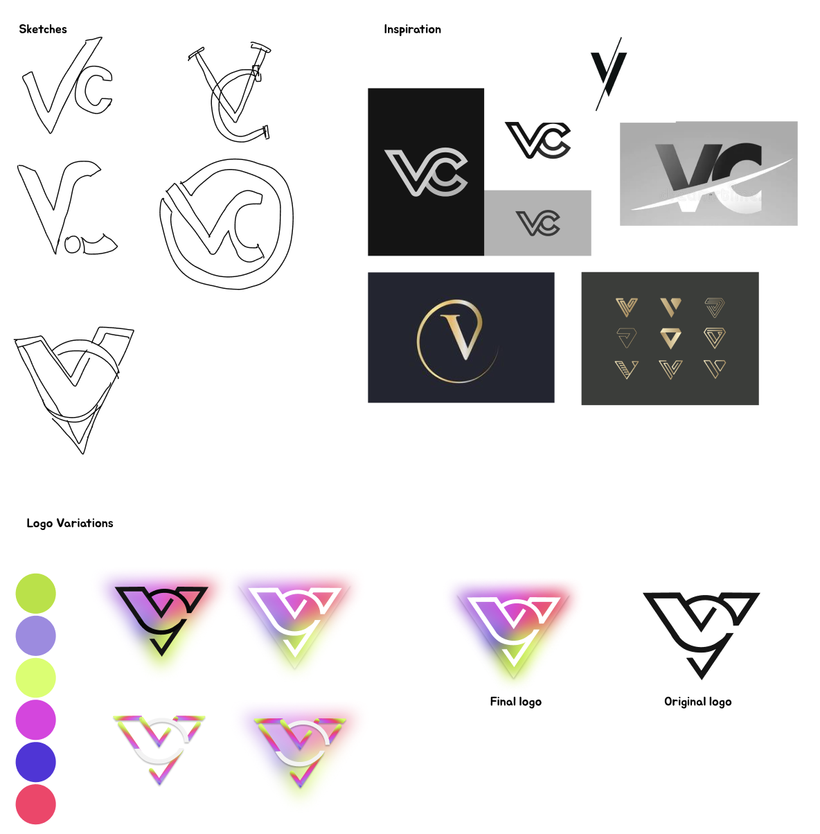
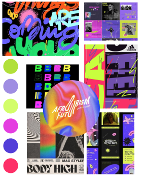
Logo & MoodBoard
I was responsible for making the logo and choosing the color palette as well as the typography based on our target audience. I took my inspiration from Pinterest and Dribble. All design decisions were tested to make sure it fit our targeted users.
I used a combination of the letters “V” and “C” because our name as a group was Viral Creatives.
We chose to go with a fun and vibrant vibe for our campaign because our target audience is young and has a passion for festivals and parties.
Design Process
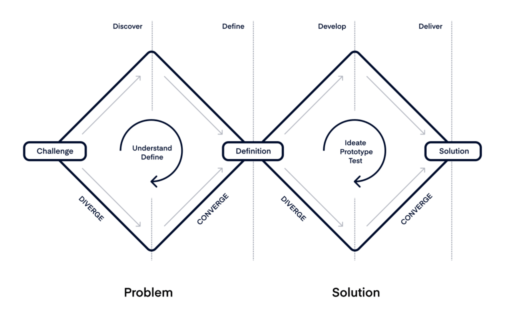
Double Diamond Method
Across my various projects, including this one, I’ve implemented the Double Diamond Method, offering me a structured approach to problem-solving and idea generation.
It ensured me a thorough understanding of user needs and context, leading to more impactful designs. I chose to apply it for its effectiveness in guiding the design process and its flexibility in adapting to project requirements, ultimately improving the quality and efficiency of my work.
Exploring User Insights
Exploring User Insights
Discover Phase
During the discovery phase of the Double Diamond, I conducted primary and secondary research. This involved interviewing a DJ to understand better the problem because he spends more time in loud places and surveying attendees to assess awareness of loud sound risks at festivals.
Additionally, I performed a competitive analysis to understand what other organizations are doing to raise awareness about hearing loss and related issues.
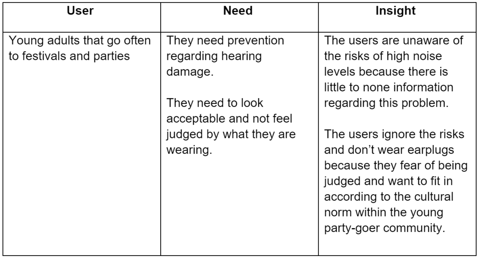
Based on my research and insights gathered by our team, we determined that our target audience is uninformed about the dangers of loud sounds. Additionally, they demonstrate hesitance towards wearing earplugs at festivals or parties due to social stigma.
Refining User Insights
Refining User Insights
2. Define Phase
During this phase, our team gathered all research and insights, assigning tasks effectively to make the most of each team member's skills. Using Miro, a management framework, we organized our efforts seamlessly.
My role involved developing a comprehensive point of view of our target users and exploring their needs and frustrations.
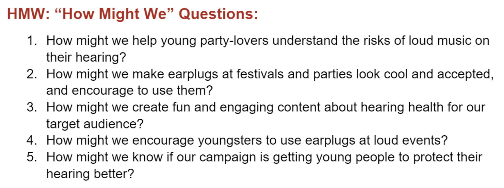
Additionally, I created "How Might We" questions, encouraging deeper exploration and refinement of our concept.
This collaborative approach not only improved our process but also deepened our understanding, enhancing the clarity and effectiveness of our design direction.
Bringing Our Concept to Life
Bringing Our Concept to Life
3. Develop Phase
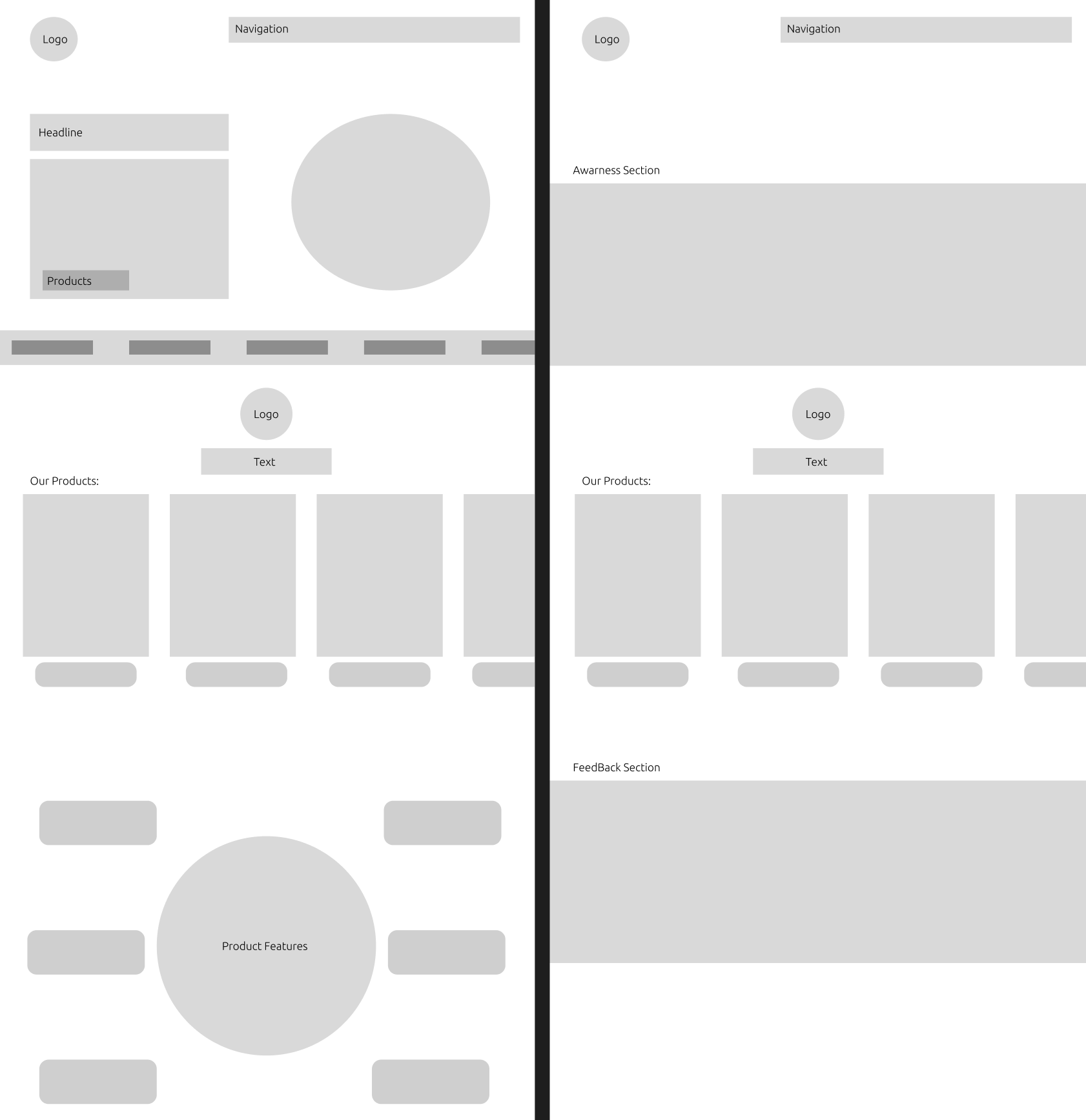
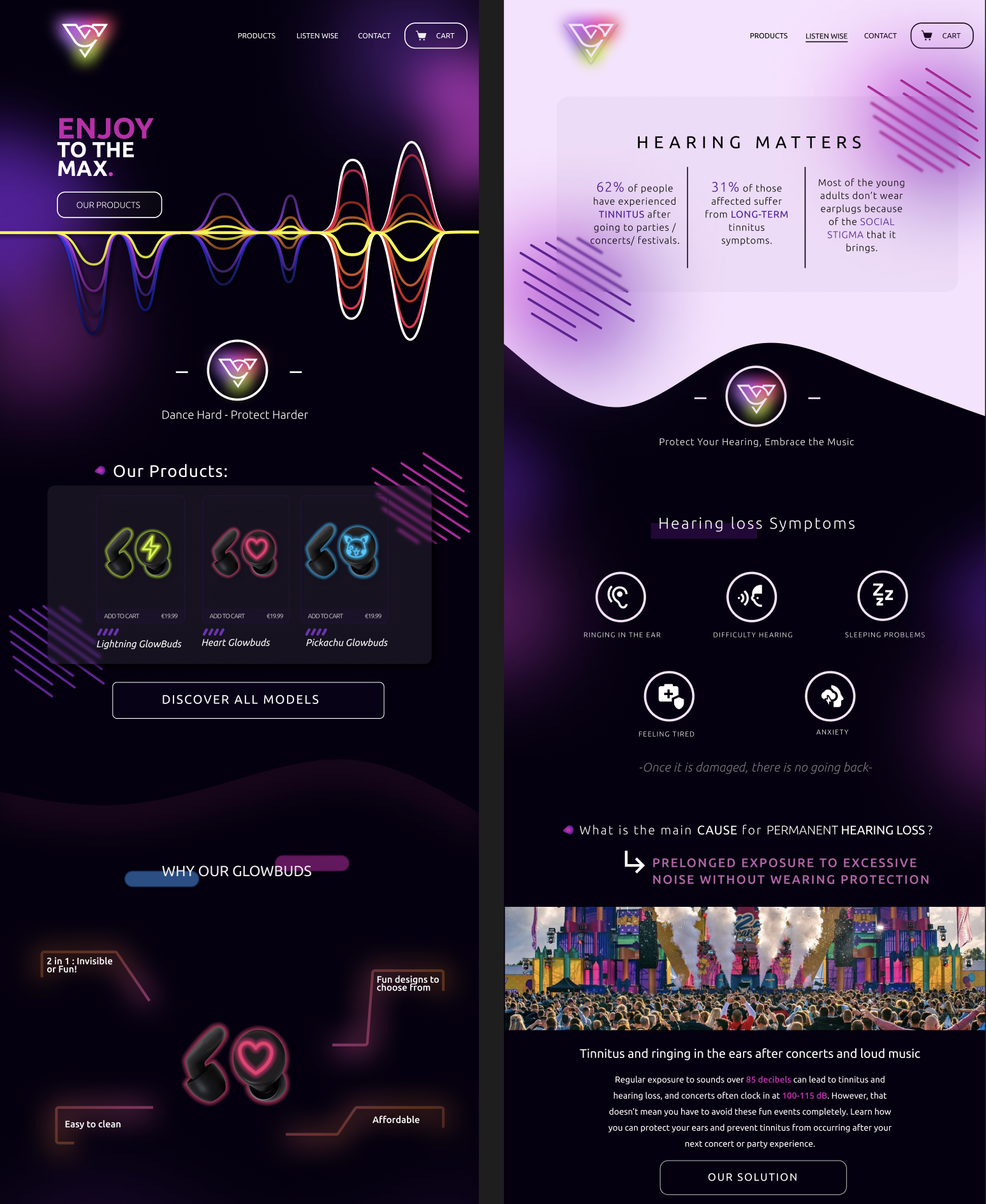
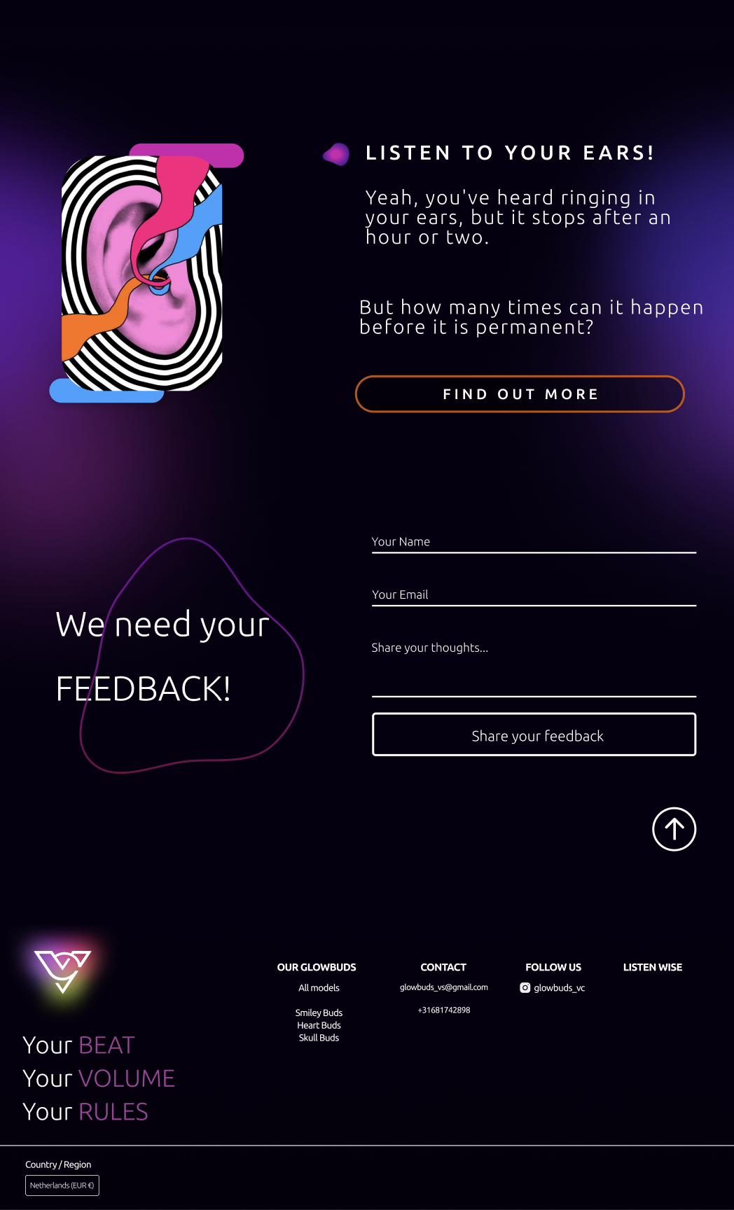
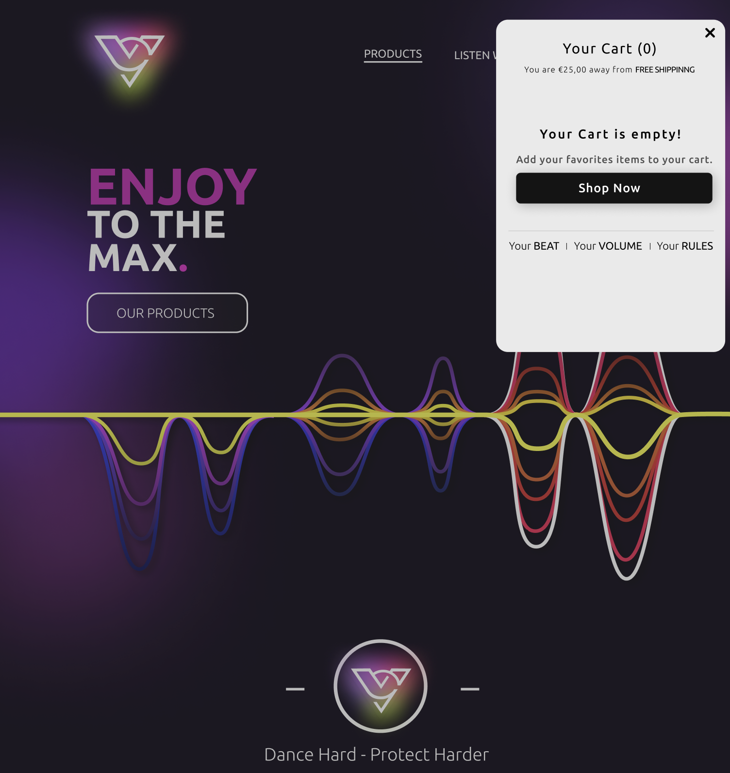
One of our methods of bringing awareness was to design and build a website on which we are going to sell our GlowBuds too: earplugs that glow in the dark. This idea/concept was tested and approved by our target audience.
Before developing the website we applied a research method in order to know what we will include in our website. We chose to make a survey to determine what preferences people have when it comes to our future website.
I was helping my team write the best questions for the survey, and later on, based on the results, I started with building a Low-Fidelity Prototype in Figma.
Results from the Survey:
⦿ The user should be able to learn about the dangers of loud noises from our website.
⦿ The user should be able to see first the products, and after information about awareness.
⦿ The user should be able to make purchases using the website
⦿ The user should be able to view more visuals than text.
⦿ The user should not be able to view ads, bad reviews, and unwanted text.
⦿ The user should be able to rate our products and services with a required star rating and unrequired text for feedback.
Figma Prototyes
-
![]()
Low-Fidelity
I started with focusing mainly on the layout and implementing roughly the features most wanted based on the previous survey.
-
![]()
High Fidelity
Keeping in mind the vibe we want to go for but also the MoodBoard I did, I furthermore designed the website, implementing design elements that have a connection with our products, such as the “soundwaves” that I designed myself.
-
![]()
Throughout the process of designing, I made sure to implement Usability Heuristics for User Interface Design & UI Patterns that are present in my final design.
-
![]()
These prototypes represent the final product.
Testing Our Concept
Testing Our Concept
4. Deliver Phase
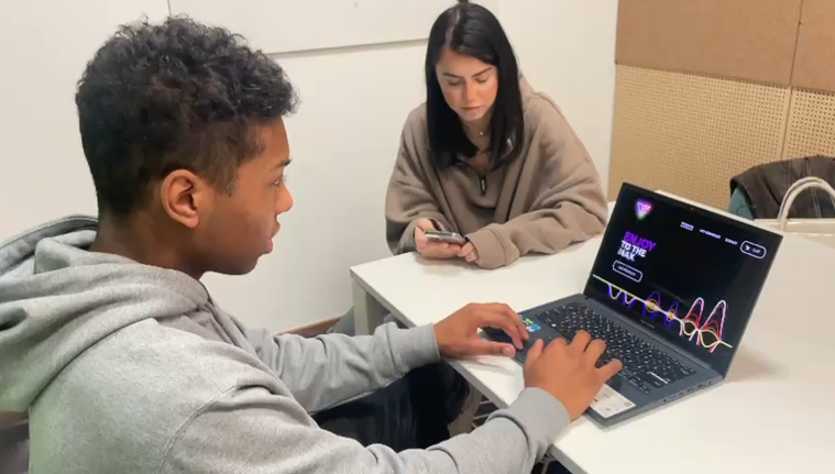
During the Deliver Phase, after finishing the High-Fidelity Prototype, it was time to do Usability Testing.
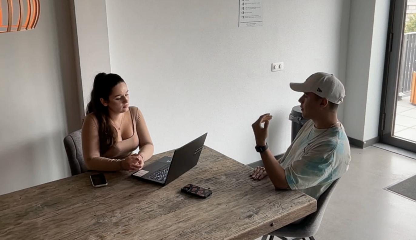
My team gathered at the university and we split up to take interviews with our target users. Together, we wrote some interview questions to begin with.
The Interview Questions:
1. What is the first thing you see on our website?
2. How can you navigate to our products?
3.Where can you find more information about the awareness of hearing damage?
4. Do you think there is enough information about the awareness?
6. Can you add & remove items from the cart?
7. Can you find the feedback section?
8.Is the content on the website clear and relevant?
9.How appealing is the website to you using a scale from 1 - 10?
10. Are you more aware of the hearing problem after your interaction with our website?
11. How easy was for you to navigate on our website on a scale 1 - 10?
WHAT WAS OUR USER'S FEEDBACK?
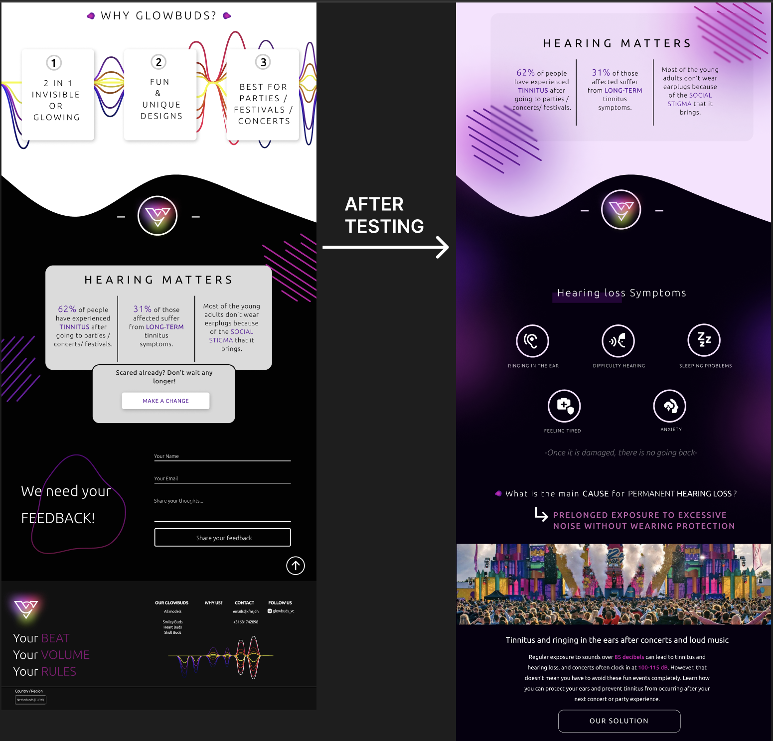
3 out of 4 users said that they couldn't find the awareness section on the website and that it was hard to find;
1 out of 4 users said that is too much going on the website (too cluttered);
3 out of 4 users said that they would like to see a much better-organized awareness section and more info about it;
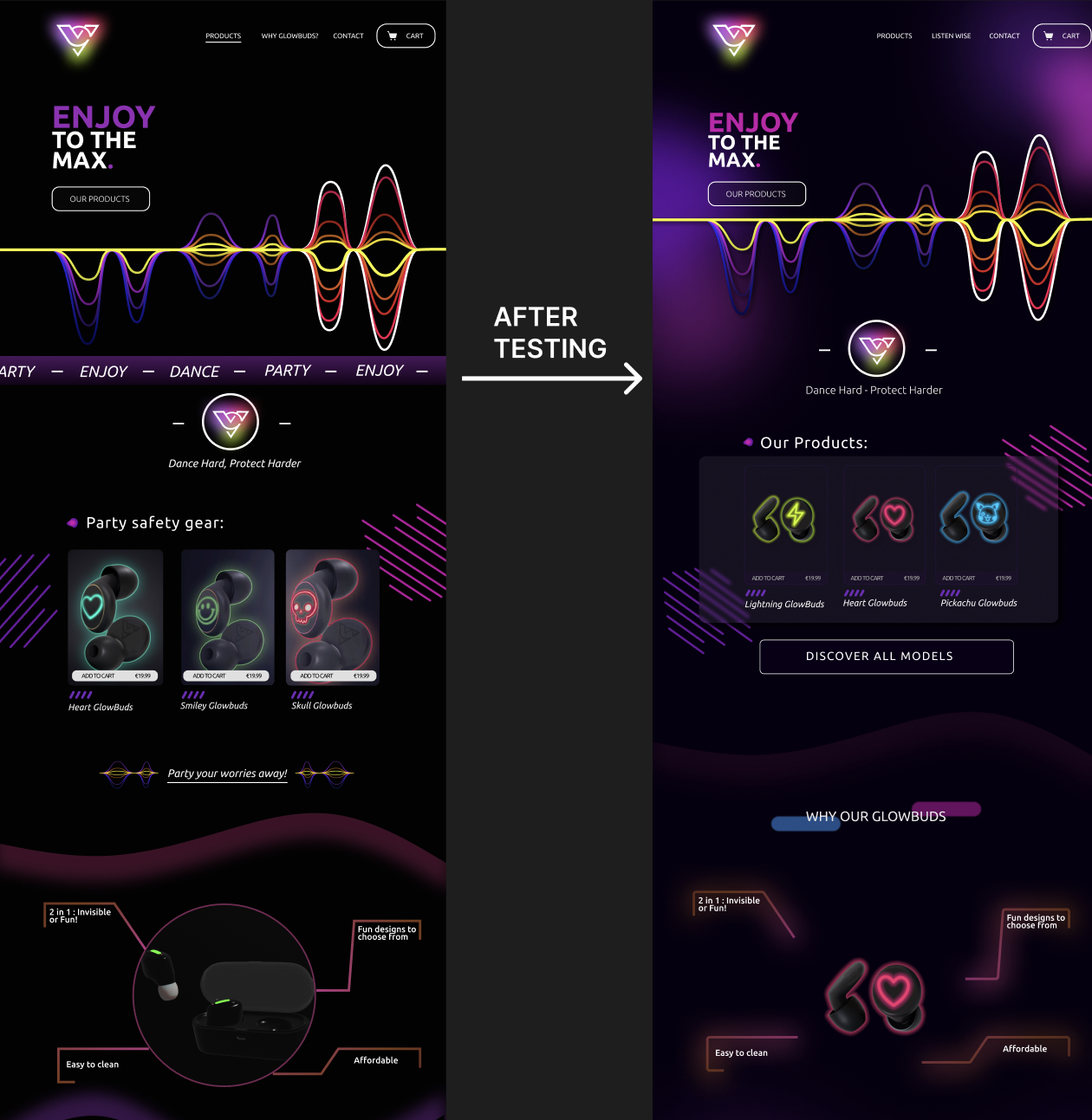
Changes after User’s FeedBack
-
Based on the users’s feedback, I changed “WHY GLOWBUDS?” TO “LISTEN WISE” in the navigation on top,to better spread awareness of our problem.
-
Moreover, I made a separate tab only about the risks of loud music, so our users can easily find the right information.
The group project in ICT significantly contributed to my career path by providing hands-on experience in applying UX and UI skills. It helped me understand the practical aspects of user-centered design principles through tasks like logo creation and refining the target audience.
•
This project was pivotal in realizing my passion for UX and UI, as I honed my skills, received feedback, and iteratively improved designs. The exposure to real-world challenges and the positive outcomes strengthened my determination to continue developing my expertise in UX and UI for future career opportunities.